
+66%
Monthly Active Learners,
12 Weeks Post Launch
-27%
Fewer Screens-To-Task
Across Core Workflows
-31%
First-Session Drop-off
Reduction, 30-Day Cohort
Summary
SudoStudy had 50,000+ students and a growing product, but the interface was working against them. Students arrived motivated and left drained, not because the content was wrong, but because the experience demanded too much mental effort before learning could begin.
I was the sole product designer, working with two engineers and one PM. I owned the entire design process from end to end: research, wireframes, prototyping, testing, and final UI. My guiding principle: every design decision must protect mental energy, not consume it.
The Challenge
SudoStudy had become a "learning labyrinth." Students preparing for exams were met with an interface that offered everything and guided nothing, with no visual hierarchy and no clear starting point. The result: 31% of new users dropped off before attempting a single question.
They weren't leaving because the product lacked value. They were leaving because it made that value too hard to reach.
Before designing anything, I needed to understand where students were losing momentum, and whether the problem was what I assumed it was.
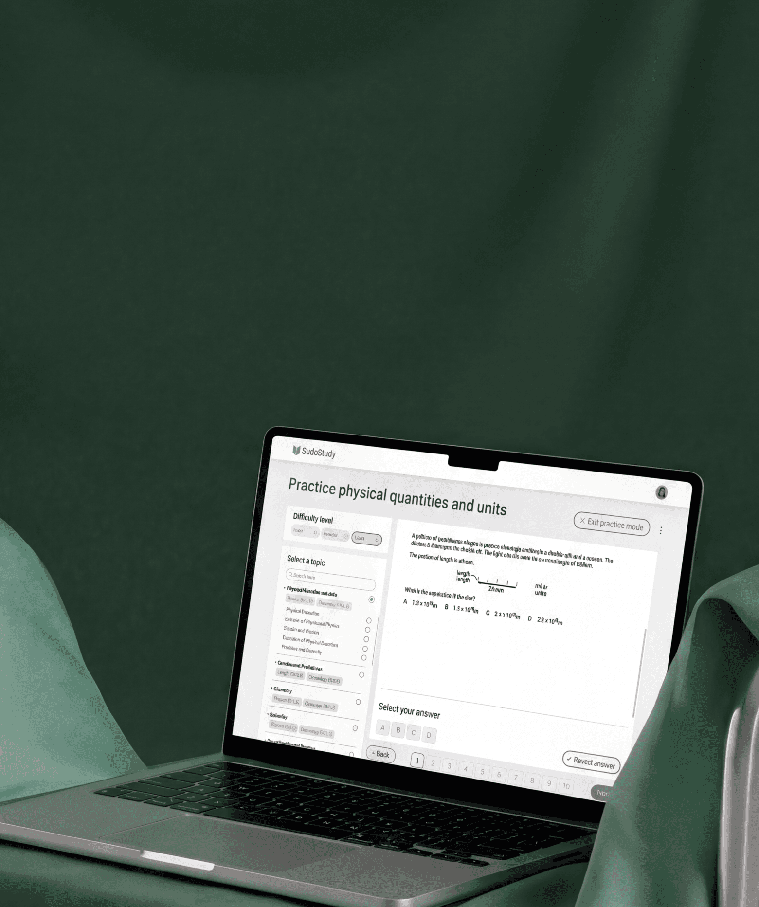
Core Experience Overhaul
The First Screen Was Losing 31% of Students
Before
Dual-Path Modal
Choice Paralysis: Competing primary actions split focus.
Weak Hierarchy: Headlines and fields competed for attention.
After
Optimized Linear Flow
Linear Activation: Vertical flow reduces mental friction.
High Impact: Eliminated the 31% drop-off rate.
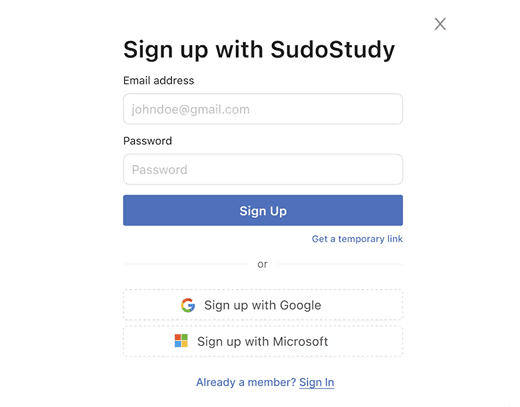
The Pivot
The original onboarding hit students with a modal containing two competing calls to action and no guidance. I redesigned entry as a single linear flow: headline, email, password, start. My first prototype kept both paths but made them cleaner; session recordings showed students still paused at the split.
The problem wasn't the design of the choice. It was the existence of a choice. The PM initially wanted to preserve the original format based on earlier marketing data; I presented session recordings showing hesitation, and we aligned on a single path. Result: 31% reduction in drop offs during the first session.
Getting Students to the Right Place
Fixing the front door solved the drop-off problem. But getting students into the product was only half the challenge, I still had to get them to the right place once they were inside.
Before
Generic Entry
No Guidance or Personalization: Generic entry points led to high initial drop offs
After
Intent-Based Routing
Linear Activation: Rapid subject/level selection lands users on a relevant dashboard.
High Impact: Self selected paths based on immediate paths
Key Change
43% of users hit three or more irrelevant screens before finding their first task. I introduced a single intent screen after sign up: what are you here to do today? That one question routes students directly to the right experience.
Core Experience Overhaul
Dashboard Evolution: From Listicle to GPS
Key Changes
Students opened the dashboard and froze. I first reorganized by subject, but testing showed 4+ taps to start a task. The problem wasn't organization; it was choice overload. I restructured the dashboard to answer three questions on load: what's due now, how am I performing, and am I consistent? A summary row shows Assigned Quizzes, Subject Health (with color coding), and Streak at a glance. Below, each subject gets one card with one action: "Start studying." Students reached their first task in under two taps (down from four), finding their next task 27% faster.
Core Experience Overhaul
From Setup Fatigue to
Instant Practice
The original practice screen required configuring difficulty, year range, exam board, and multiple topics before starting. I restructured around one question: what's your weakest area? The filter sidebar became a progress map showing Health and Coverage scores per topic. The ability to select multiple topics became a single selection. I stripped distracting header CTAs and added numbered question sequences with clear navigation.
Limiting options to five per screen barely moved completion rates. Showing weakness scores next to each topic created a natural starting point instead. Result: 22% lift in sessions exceeding 20 minutes. Selecting one topic at a time limits batching, but it aligns with actual student behavior; practicing across multiple topics was bookmarked as a future advanced mode.
Core Experience Overhaul
Replacing Five Screens
With One
Students previously needed 5+ screen visits across tabs and disconnected reports to understand progress. I collapsed everything into one view answering: where do I stand, what should I focus on, and how do I start? An overall score at the top gives instant orientation. Health and Coverage scores break performance into actionable dimensions. A Recommended Topics section surfaces weak areas with access in one tap. An earlier version based on difficulty filters was ignored entirely, as students wanted exam relevance, not abstract ranking. Power users lose some granular detail, but most students started practicing instead of reviewing stats. Return visits increased as students could see scores changing over time.
The Compound Effect
66%
The compound result of fewer drop
offs, faster navigation, and higher return rates: 66% overall engagement increase, measured 12 weeks after launch.
A Shift In Logic
Reflections
The Assumption That Broke First
I entered treating this as a content
discovery problem. Session after session proved students found content fine. They were mentally spent before they could use
it. The reframe from "help them find" to "stop draining them" reshaped every decision.
My Most Expensive Lesson
I spent three weeks refining dashboard layouts before any student testing. Both versions looked cleaner; neither mattered. Students wanted to be told what to do next. Speed to feedback beats speed to fidelity, every time.
What EdTech Demands
Most products compete for attention.
Learning products must protect it. Features aren't free, as each one costs a piece of focus. The best work I did wasn't what I added. It was what I removed.

ED TECH
Product Strategy
ux reSEARCH
Protecting Student
Cognitive Energy
:
A 66% Growth Story
How I redesigned a cluttered EdTech platform to respect how students actually think
ED TECH
Product Strategy
ux reSEARCH
Protecting Student
Cognitive Energy
:
A 66% Growth Story
How I redesigned a cluttered EdTech platform to respect how students actually think
trending_up
+66%
MONTHLY active LEARNERS,
12 WEEKS POST LAUNCH
trending_down
-27%
Fewer screens-to-task across core workflows
trending_down
-31%
First-session drop-off reduction, 30-day cohort
Summary
SudoStudy had 50,000+ students and a growing product, but the interface was working against them. Students were arriving motivated and leaving drained, not because the content was wrong, but because the experience demanded too much mental effort before learning could even begin.
I was the sole product designer, working alongside two engineers and one product manager. I owned the end-to-end design process, the research, wireframes, prototyping, testing, and final UI. The PM defined business priorities. I defined how students would experience them. My guiding principle throughout: every design decision must protect mental energy, not consume it.
The Challenge
SudoStudy had become what I started calling a "learning labyrinth." Students preparing for exams, already anxious, were met with an interface that offered everything and guided nothing. No visual hierarchy. No clear starting point. Just options.
The result: 31% of new users dropped off before attempting a single practice question. They weren't leaving because the product lacked value. They were leaving because the product made that value too hard to reach.
Before designing anything, I needed to understand where students were losing momentum, and whether the problem was what I assumed it was.


Discovery
12 User Interviews
I conducted deep-dive sessions with students across three learning stages to map where confidence broke down.

Usability
5 Moderated Tests
I watched students navigate the platform in real time to identify where hesitation and frustration peaked.

Quantitative
450+ Drop-off Points
I mapped exactly where friction spiked using PostHog analytics across a six-week window.

Benchmarking
Audit & Reviews
I analyzed three competing EdTech platforms to benchmark attention and effort patterns against ours.
friction mapping
Where Students Were Breaking Down
I synthesized interview transcripts, usability recordings, and analytics data to identify three core friction patterns, each one draining student energy in a different way, at a different moment in the journey.

analytics
Why Browsing Isn't Learning
“I'd log in, scroll around, and log out. I didn't even know where to start."
observation
The analytics confirmed it: 31% of students would log in, drift through the dashboard for a few minutes, and leave without attempting a single lesson. They weren't disengaged, they were overwhelmed.
root cause
The dashboard presented every available option at once. This triggered immediate decision paralysis, students burned their mental energy choosing what to do instead of actually doing it.
design pivot
Guided entry + a "Next Best Action" engine that eliminates the need to choose.
psychology
The Forgetting Loop
"Every time I came back, it felt like I was starting from scratch."
observation
Students would complete a module and never return. There was no hook pulling them forward, finishing felt like checking off a chore, not building momentum.
root cause
The interface was a static list with no sense of progression. Without a visual arc showing how far they'd come or what was next, there was no psychological pull to return. I identified a missing Zeigarnik Effect, that mental itch to finish what you've started. The platform gave students no reason to feel that itch.
design pivot
From static list to a Learning OS with progress indicators, streaks, and a clear forward path.
sync
The Interface Was the Bottleneck
"I keep getting distracted by things on screen that have nothing to do with what I'm studying."
observation
During moderated tests, students appeared visibly drained after just 15 minutes. Session lengths hit a ceiling regardless of content difficulty, the interface itself was the bottleneck.
root cause
Every extra button and notification created 'Buffer Effort', the mental cost of ignoring irrelevant UI. In 34 of 48 sessions, students hesitated before the material, not because of it.
design pivot
Stripped-down UI with an isolated loop removing everything non-essential during study.
initial onboarding
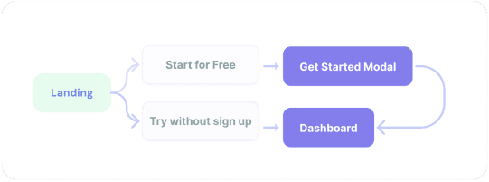
The First Screen Was Losing 31% of Students

Dual Path Modal
close
Choice Paralysis
Competing primary actions split focus.
close
Weak Hierarchy
Headlines and fields competed for attention.

Optimized Modal
check_circle
Linear Activation
Vertical flow reduces mental friction.
check_circle
High Impact
Eliminated the 31% drop-off rate.
psychology
The Insight
The original onboarding hit students with a dual-CTA modal on the very first screen, two competing paths with no guidance on which to choose. For an anxious student about to start exam prep, that split-second hesitation was enough to bounce.
alt_route
The Fix
I redesigned the entry screen as a single linear flow: headline, email, password, start. No choices. No modals. Just forward momentum.
My first prototype kept the dual-path structure but reduced it to two cleaner options. Session recordings showed students still paused at the split, even a polished fork in the road was still a fork. The problem wasn't the design of the choice. It was the existence of a choice. Five moderated tests on the revised flow confirmed it, zero hesitation at the first screen, every session.
verified
The Result
The Result 31% reduction in first-session drop-offs and significantly faster time-to-value for new users.
USER FLOW TRANSFORMATION
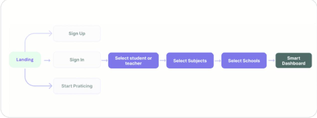
Getting Students to the Right Place
Fixing the front door solved the drop-off problem. But getting students into the product was only half the challenge, I still had to get them to the right place once they were inside.
Before
Generic Entry

Result: Vague entry points led to high initial drop-offs.
close
No Guidance or Personalization
Generic entry points led to high initial drop offs
After
Intent-Based Routing

Result: Intent based routing
check_circle
Linear Activation
Rapid subject/level selection lands users on a relevant dashboard.
check_circle
High Impact
Self selected paths based on
immediate paths
Session data showed that 43% of users hit three or more irrelevant screens before finding their first task. The generic entry point assumed all students had the same intent, but a first-time user preparing for an exam next week and a returning student reviewing past mistakes need completely different starting points.
That's what drove the shift to intent-based routing. After sign-up, the flow now asks one question: what are you here to do today? That single intent screen routes students directly to the right experience.
My first iteration routed users by content type. Testing showed students don't think in content types, they think in goals. That insight reshaped the entire routing architecture. After shipping the intent-based routing, first-session task completion improved by 40% compared to the original generic entry.
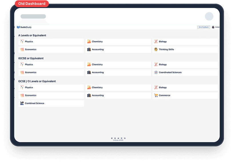
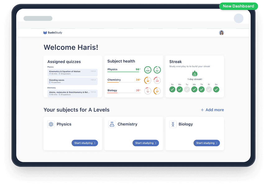
Core Experience Overhaul
Dashboard Evolution:
From Listicle to GPS
psychology
The Insight
Students like Sophie opened the dashboard and froze. No visual hierarchy. No sense of where to start. Just a long list of content that demanded a decision before offering any value.
psychology
What I Tried First
I reorganized the dashboard by subject, a cleaner version of the same list. Testing showed students still took 4+ taps to start a task. The problem wasn't organization. It was choice overload.
alt_route
The Pivot
I restructured the dashboard to answer three questions the moment it loads: what's due, how am I doing, and am I being consistent?
Assigned Quizzes, Subject Health, and Streak sit side by side at the top — a complete status read before scrolling. Color-coded health scores show weak spots at a glance. Below, each subject gets one card with one action: "Start studying."
A second round of testing confirmed it; students reached their first task in under two taps, down from four.
verified
The Result
Students found their next task 27% faster. Not because I removed features, but because I stopped making them think about where to look.

Old Dashboard

New Dashboard
Core Experience Overhaul
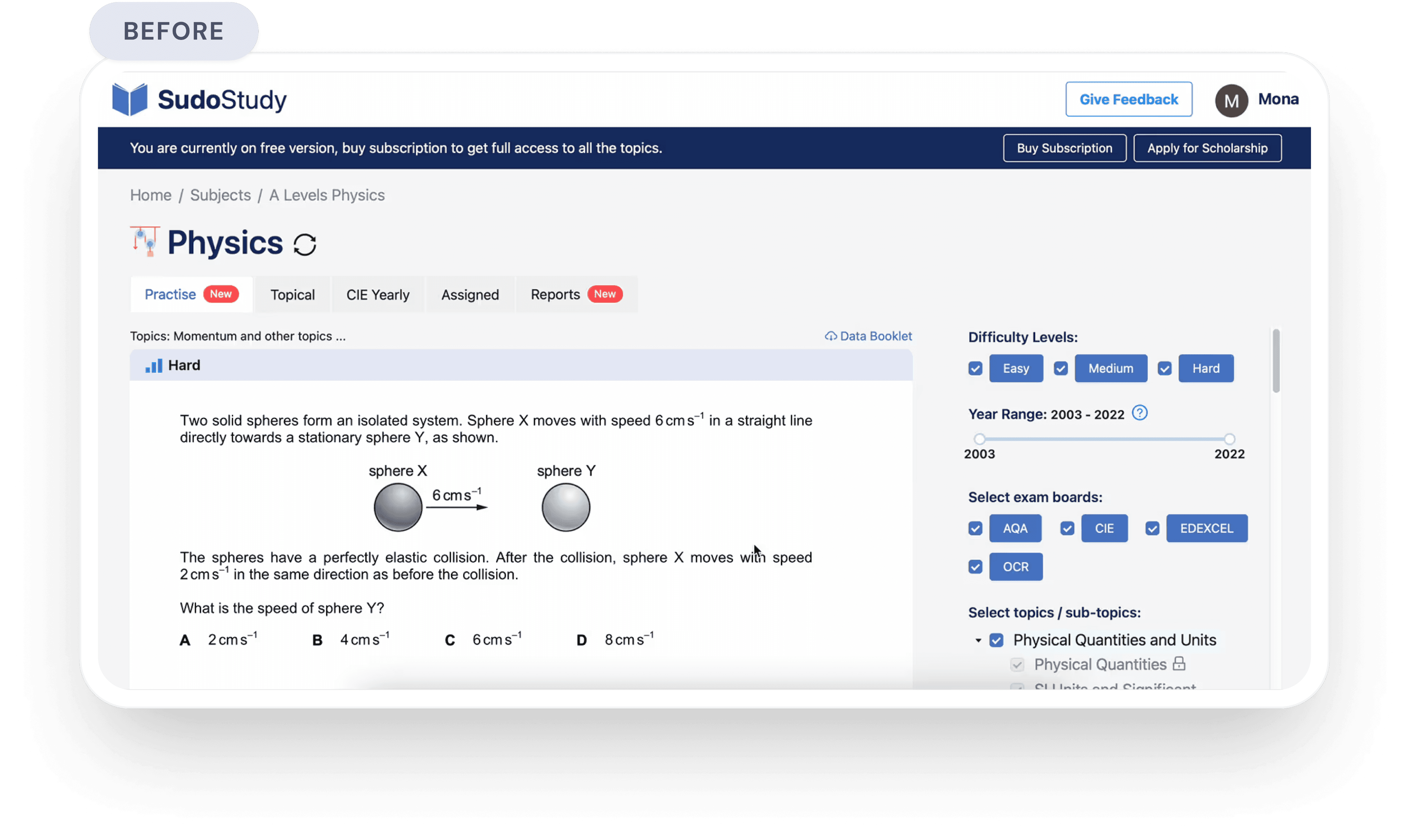
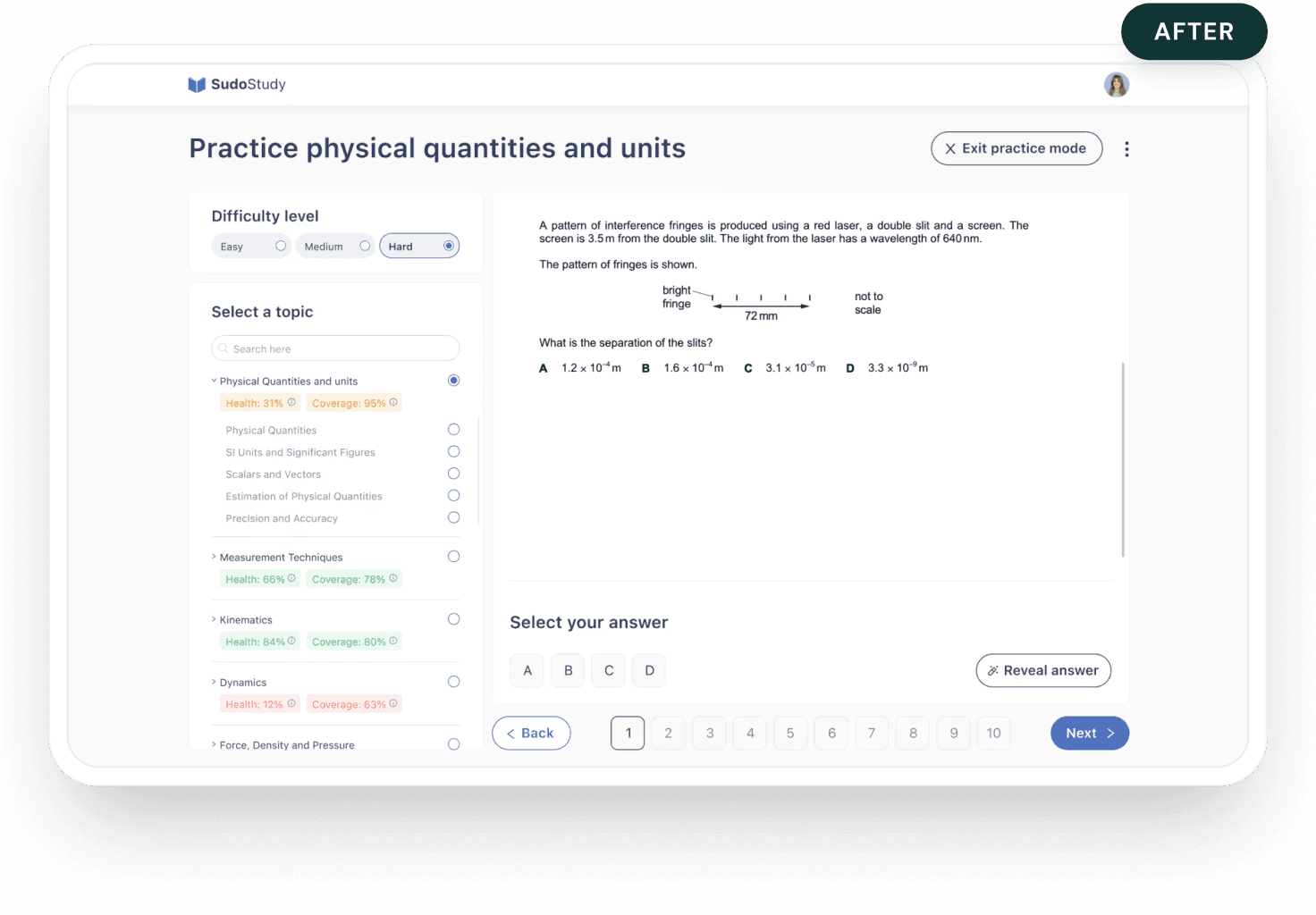
From Setup Fatigue to Instant Practice
psychology
The Insight
The original practice screen asked students to configure their own session, pick a difficulty, select a year range, choose an exam board, tick multiple topics, then start. For a student who just wanted to practice one concept, it felt like filling out a form before being allowed to learn.
alt_route
The Pivot
I restructured the practice experience around one question: what's your weakest area right now?
The filter-heavy sidebar became a progress map; each topic showing Health and Coverage scores so students can see where they need work. Multi-select became single-select. Distracting header CTAs were stripped entirely. A numbered question sequence with Back/Next controls replaced the old floating format, giving students position and momentum.
I initially tried limiting options to five per screen. Completion rates barely moved. The issue wasn't quantity, it was the absence of a clear starting point. Showing weakness scores next to each topic created that starting point naturally.
alt_route
The Trade Offs
Single-select limits batching, but it aligns with how students actually work. I bookmarked multi-topic practice as a future advanced mode — a deliberate scoping decision, not an oversight.
verified
ROI
22% Lift
22% Lift in sessions exceeding 20 minutes and measurably higher user
comfort scores.
verified_user

After
check_circle
Scannable UI Cards
Card-based format provides an instant overview of progress and subjects.
check_circle
Live Feedback
Health and Coverage scores guide students toward areas needing mastery.

Before
close
Manual Recall
High cognitive load required students to track their own study status.
close
Static Listicle
Topics were presented in a flat, unprioritized list with no visual focus.
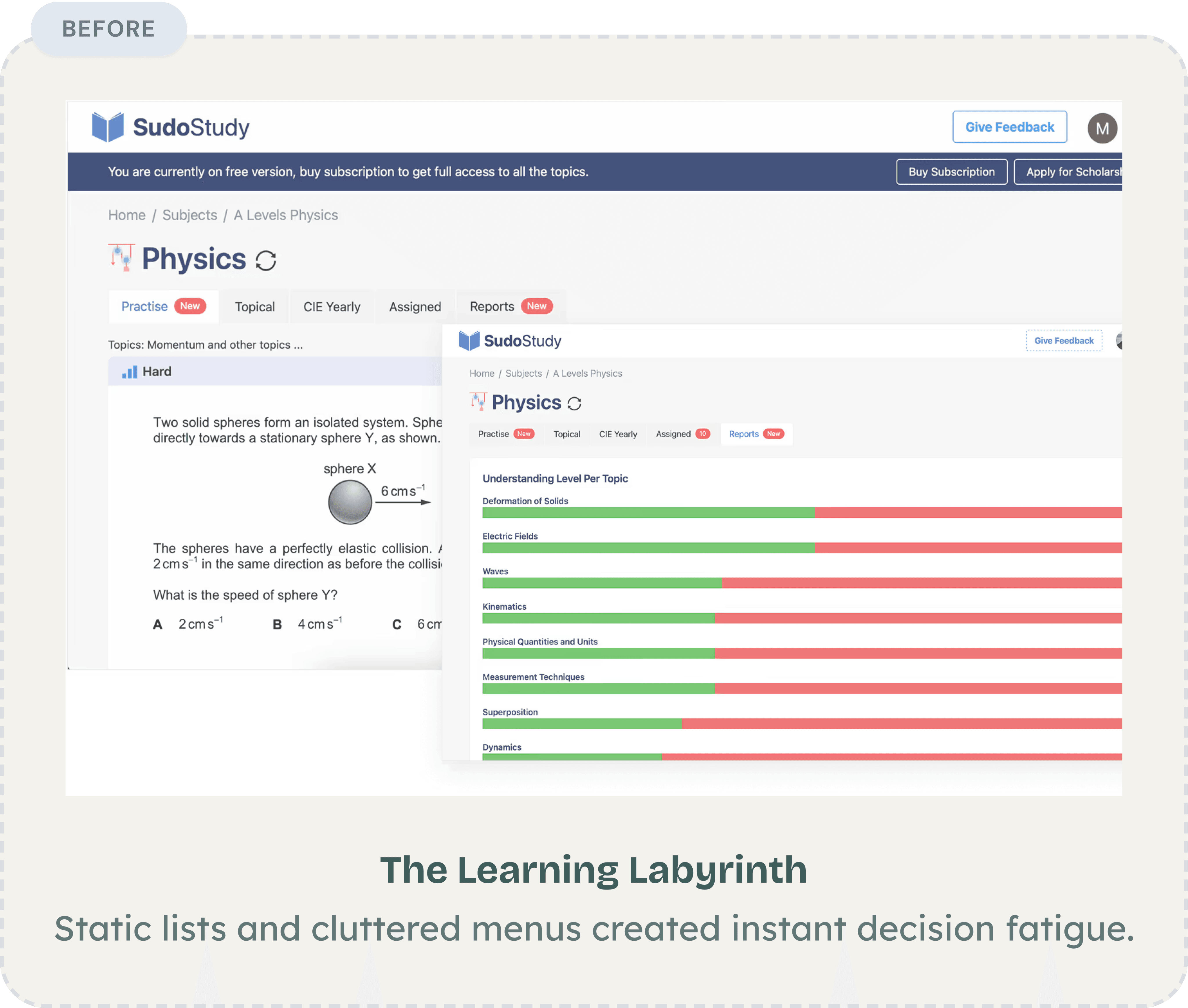
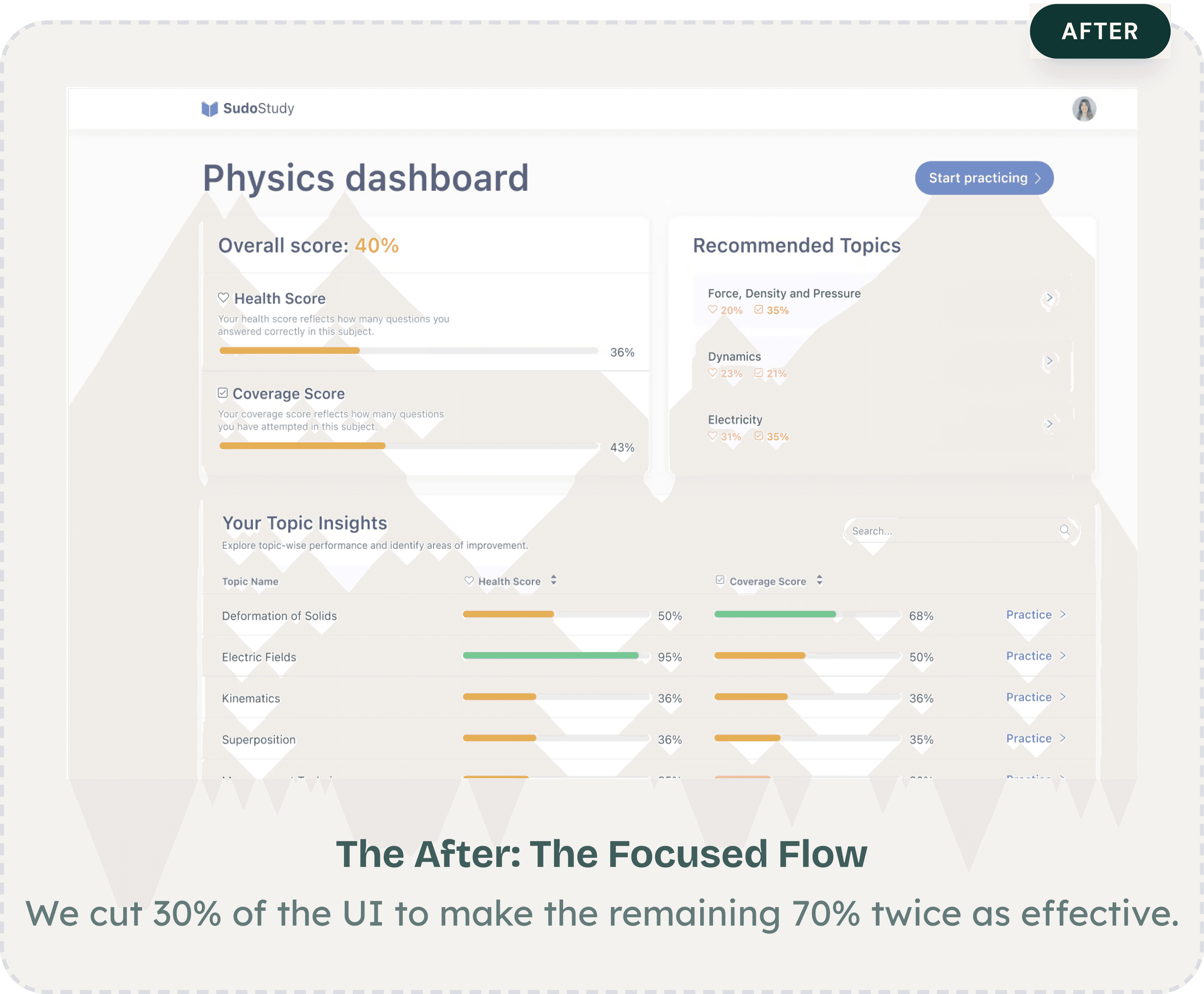
Core Experience Overhaul
Replacing Five Screens With One


Before: The Learning Labyrinth
Static lists and cluttered menus created instant decision fatigue.


The After: The Focused Flow
We cut 30% of the UI to make the remaining 70% twice as effective.
After
psychology
The Insight
The original subject view hit students with five tabs, a difficulty label with no context, and a practice question, all before telling them how they were actually performing. A separate reports screen showed colored bars per topic with no scoring framework, no recommendations, and no connection to what the student should do next. Students had to visit multiple screens and mentally piece together their own progress. Most didn't bother.
alt_route
The Pivot
I collapsed the experience into a single dashboard that answers three questions: where do I stand, what should I focus on, and how do I start?
An overall score at the top gives instant orientation. Health Score and Coverage Score beneath it break performance into two actionable dimensions. A Recommended Topics section surfaces weak areas with one-tap access to practice — no guesswork.
An earlier version filtered content by difficulty level. Students ignored the filters entirely — they wanted relevance, not ranking. That insight killed the filter approach and led to the recommendation engine instead.
alt_route
The Trade Offs
The new dashboard hides the granular topic-by-topic breakdown behind a scrollable table instead of leading with it. Power users lose some at-a-glance detail. But for the majority of students, fewer decisions upfront meant they actually started practicing instead of reviewing their stats.
verified
The Result
Students went from 5+ screens to one complete view. Time-to-first-practice dropped, and return visits increased as students could watch their scores improve in real time.
verified_user

the compound effect
66%
The compound result of fewer drop-offs, faster navigation, and higher return rates, measured 12 weeks post-launch.
the compound effect
66%
The compound result of fewer drop-offs, faster navigation, and higher return rates, measured 12 weeks post-launch.
a shift in logic
What This Project Taught Me
Three things I'd tell myself if I could restart this project tomorrow.
The Assumption That Broke First
The biggest surprise wasn't in the data but it was in my own framing. I walked in treating this as a content discovery problem: students couldn't find the right material.
But session after session showed the same pattern. Students found content just fine. They were mentally spent before they could do anything with it. That reframe, from "help them find" to "stop draining them" reshaped every decision that followed.
My Most Expensive Lesson
I spent three weeks refining the dashboard before testing it with a single student. First version: organized by subject. Second: grouped by difficulty. Both cleaner. Neither mattered.
Students weren't looking for better organization, they wanted to be told what to do next. Speed to feedback beats speed to fidelity, every time.
What EdTech Demands That Other Products Don't
Most products compete for attention. Learning products have to protect it. That distinction changed how I evaluate every design decision now.
Features aren't free, each one costs the student a small piece of focus. The best work I did on this project wasn't what I added. It was what I removed.
These changes shipped in March 2025. SudoStudy has since grown to 55k students and the patterns we established are still the foundation of the product today.
ED TECH
Product Strategy
ux reSEARCH
Protecting Student
Cognitive Energy
:
A 66% Growth Story
How I redesigned a cluttered EdTech platform to respect how students actually think
trending_up
+66%
MONTHLY active LEARNERS,
12 WEEKS POST LAUNCH
trending_down
-27%
Fewer screens-to-task across core workflows
trending_down
-31%
First-session drop-off reduction, 30-day cohort
Summary
SudoStudy had 50,000+ students and a growing product, but the interface was working against them. Students were arriving motivated and leaving drained, not because the content was wrong, but because the experience demanded too much mental effort before learning could even begin.
I was the sole product designer, working alongside two engineers and one product manager. I owned the end-to-end design process, the research, wireframes, prototyping, testing, and final UI. The PM defined business priorities. I defined how students would experience them. My guiding principle throughout: every design decision must protect mental energy, not consume it.
The Challenge
SudoStudy had become what I started calling a "learning labyrinth." Students preparing for exams, already anxious, were met with an interface that offered everything and guided nothing. No visual hierarchy. No clear starting point. Just options.
The result: 31% of new users dropped off before attempting a single practice question. They weren't leaving because the product lacked value. They were leaving because the product made that value too hard to reach.
Before designing anything, I needed to understand where students were losing momentum, and whether the problem was what I assumed it was.
Discovery
12 User Interviews
I conducted deep-dive sessions with students across three learning stages to map where confidence broke down.
Usability
5 Moderated Tests
I watched students navigate the platform in real time to identify where hesitation and frustration peaked.
Quantitative
450+ Drop-off Points
I mapped exactly where friction spiked using PostHog analytics across a six-week window.
Benchmarking
Audit & Reviews
I analyzed three competing EdTech platforms to benchmark attention and effort patterns against ours.
friction mapping
Where Students Were Breaking Down
I synthesized interview transcripts, usability recordings, and analytics data to identify three core friction patterns, each one draining student energy in a different way, at a different moment in the journey.
analytics
Why Browsing Isn't Learning
“I'd log in, scroll around, and log out. I didn't even know where to start."
observation
The analytics confirmed it: 31% of students would log in, drift through the dashboard for a few minutes, and leave without attempting a single lesson. They weren't disengaged, they were overwhelmed.
root cause
The dashboard presented every available option at once. This triggered immediate decision paralysis, students burned their mental energy choosing what to do instead of actually doing it.
design pivot
Guided entry + a "Next Best Action" engine that eliminates the need to choose.
psychology
The Forgetting Loop
"Every time I came back, it felt like I was starting from scratch."
observation
Students would complete a module and never return. There was no hook pulling them forward, finishing felt like checking off a chore, not building momentum.
root cause
The interface was a static list with no sense of progression. Without a visual arc showing how far they'd come or what was next, there was no psychological pull to return. I identified a missing Zeigarnik Effect, that mental itch to finish what you've started. The platform gave students no reason to feel that itch.
design pivot
From static list to a Learning OS with progress indicators, streaks, and a clear forward path.
sync
The Interface Was the Bottleneck
"I keep getting distracted by things on screen that have nothing to do with what I'm studying."
observation
During moderated tests, students appeared visibly drained after just 15 minutes. Session lengths hit a ceiling regardless of content difficulty, the interface itself was the bottleneck.
root cause
Every extra button and notification created 'Buffer Effort', the mental cost of ignoring irrelevant UI. In 34 of 48 sessions, students hesitated before the material, not because of it.
design pivot
Stripped-down UI with an isolated loop removing everything non-essential during study.
initial onboarding
The First Screen Was Losing 31% of Students
Dual Path Modal
close
Choice Paralysis
Competing primary actions split focus.
close
Weak Hierarchy
Headlines and fields competed for attention.
Optimized Modal
check_circle
Linear Activation
Vertical flow reduces mental friction.
check_circle
High Impact
Eliminated the 31% drop-off rate.
psychology
The Insight
The original onboarding hit students with a dual-CTA modal on the very first screen, two competing paths with no guidance on which to choose. For an anxious student about to start exam prep, that split-second hesitation was enough to bounce.
alt_route
The Fix
I redesigned the entry screen as a single linear flow: headline, email, password, start. No choices. No modals. Just forward momentum.
My first prototype kept the dual-path structure but reduced it to two cleaner options. Session recordings showed students still paused at the split, even a polished fork in the road was still a fork. The problem wasn't the design of the choice. It was the existence of a choice. Five moderated tests on the revised flow confirmed it, zero hesitation at the first screen, every session.
verified
The Result
The Result 31% reduction in first-session drop-offs and significantly faster time-to-value for new users.
USER FLOW TRANSFORMATION
Getting Students to the Right Place
Fixing the front door solved the drop-off problem. But getting students into the product was only half the challenge, I still had to get them to the right place once they were inside.
Before
Generic Entry
Result: Vague entry points led to high initial drop-offs.
close
No Guidance or Personalization
Generic entry points led to high initial drop offs
After
Intent-Based Routing
Result: Intent based routing
check_circle
Linear Activation
Rapid subject/level selection lands users on a relevant dashboard.
check_circle
High Impact
Self selected paths based on
immediate paths
Session data showed that 43% of users hit three or more irrelevant screens before finding their first task. The generic entry point assumed all students had the same intent, but a first-time user preparing for an exam next week and a returning student reviewing past mistakes need completely different starting points.
That's what drove the shift to intent-based routing. After sign-up, the flow now asks one question: what are you here to do today? That single intent screen routes students directly to the right experience.
My first iteration routed users by content type. Testing showed students don't think in content types, they think in goals. That insight reshaped the entire routing architecture. After shipping the intent-based routing, first-session task completion improved by 40% compared to the original generic entry.
Core Experience Overhaul
Dashboard Evolution:
From Listicle to GPS
psychology
The Insight
Students like Sophie opened the dashboard and froze. No visual hierarchy. No sense of where to start. Just a long list of content that demanded a decision before offering any value.
psychology
What I Tried First
I reorganized the dashboard by subject, a cleaner version of the same list. Testing showed students still took 4+ taps to start a task. The problem wasn't organization. It was choice overload.
alt_route
The Pivot
I restructured the dashboard to answer three questions the moment it loads: what's due, how am I doing, and am I being consistent?
Assigned Quizzes, Subject Health, and Streak sit side by side at the top — a complete status read before scrolling. Color-coded health scores show weak spots at a glance. Below, each subject gets one card with one action: "Start studying."
A second round of testing confirmed it; students reached their first task in under two taps, down from four.
verified
The Result
Students found their next task 27% faster. Not because I removed features, but because I stopped making them think about where to look.
Old Dashboard
New Dashboard
Core Experience Overhaul
From Setup Fatigue to Instant Practice
psychology
The Insight
The original practice screen asked students to configure their own session, pick a difficulty, select a year range, choose an exam board, tick multiple topics, then start. For a student who just wanted to practice one concept, it felt like filling out a form before being allowed to learn.
alt_route
The Pivot
I restructured the practice experience around one question: what's your weakest area right now?
The filter-heavy sidebar became a progress map; each topic showing Health and Coverage scores so students can see where they need work. Multi-select became single-select. Distracting header CTAs were stripped entirely. A numbered question sequence with Back/Next controls replaced the old floating format, giving students position and momentum.
I initially tried limiting options to five per screen. Completion rates barely moved. The issue wasn't quantity, it was the absence of a clear starting point. Showing weakness scores next to each topic created that starting point naturally.
alt_route
The Trade Offs
Single-select limits batching, but it aligns with how students actually work. I bookmarked multi-topic practice as a future advanced mode — a deliberate scoping decision, not an oversight.
verified
ROI
22% Lift
22% Lift in sessions exceeding 20 minutes and measurably higher user
comfort scores.
verified_user
After
check_circle
Scannable UI Cards
Card-based format provides an instant overview of progress and subjects.
check_circle
Live Feedback
Health and Coverage scores guide students toward areas needing mastery.
Before
close
Manual Recall
High cognitive load required students to track their own study status.
close
Static Listicle
Topics were presented in a flat, unprioritized list with no visual focus.
Core Experience Overhaul
Replacing Five Screens With One
Before: The Learning Labyrinth
Static lists and cluttered menus created instant decision fatigue.
The After: The Focused Flow
We cut 30% of the UI to make the remaining 70% twice as effective.
After
psychology
The Insight
The original subject view hit students with five tabs, a difficulty label with no context, and a practice question, all before telling them how they were actually performing. A separate reports screen showed colored bars per topic with no scoring framework, no recommendations, and no connection to what the student should do next. Students had to visit multiple screens and mentally piece together their own progress. Most didn't bother.
alt_route
The Pivot
I collapsed the experience into a single dashboard that answers three questions: where do I stand, what should I focus on, and how do I start?
An overall score at the top gives instant orientation. Health Score and Coverage Score beneath it break performance into two actionable dimensions. A Recommended Topics section surfaces weak areas with one-tap access to practice: no guesswork.
An earlier version filtered content by difficulty level. Students ignored the filters entirely; they wanted relevance, not ranking. That insight killed the filter approach and led to the recommendation engine instead.
alt_route
The Trade Offs
The new dashboard hides the granular topic-by-topic breakdown behind a scrollable table instead of leading with it. Power users lose some at-a-glance detail. But for the majority of students, fewer decisions upfront meant they actually started practicing instead of reviewing their stats.
verified
The Result
Students went from 5+ screens to one complete view. Time-to-first-practice dropped, and return visits increased as students could watch their scores improve in real time.
verified_user
the compound effect
66%
The compound result of fewer drop-offs, faster navigation, and higher return rates, measured 12 weeks post-launch.
a shift in logic
What This Project Taught Me
Three things I'd tell myself if I could restart this project tomorrow.
The Assumption That Broke First
The biggest surprise wasn't in the data but it was in my own framing. I walked in treating this as a content discovery problem: students couldn't find the right material.
But session after session showed the same pattern. Students found content just fine. They were mentally spent before they could do anything with it. That reframe, from "help them find" to "stop draining them" reshaped every decision that followed.
My Most Expensive Lesson
I spent three weeks refining the dashboard before testing it with a single student. First version: organized by subject. Second: grouped by difficulty. Both cleaner. Neither mattered.
Students weren't looking for better organization, they wanted to be told what to do next. Speed to feedback beats speed to fidelity, every time.
What EdTech Demands That Other Products Don't
Most products compete for attention. Learning products have to protect it. That distinction changed how I evaluate every design decision now.
Features aren't free, each one costs the student a small piece of focus. The best work I did on this project wasn't what I added. It was what I removed.
These changes shipped in March 2025. SudoStudy has since grown to 55k students and the patterns we established are still the foundation of the product today.


Fatima Sumair
© 2026 Fatima Sumair. All rights reserved.

© 2026. All rights reserved.